Tag Archives: Udit Malhotra

Content Aggregation

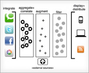
Content Aggregation Applications are the most trending applications on Internet today.  Content Aggregation Applications are applications which allow Users to read about Latest Topics and most Popular Posts of their choice on the Net without searching for the same across multiple sites.

Content Aggregation Applications/ Apps aggregate Topics of Social Interaction display the same on using Social Readers on Social Media Networks like Facebook, Google+, Orkut, Four Square, Twitter, etc. .

Some of the most used News and Business News related Social Reading Applications are The Wall Street Journal, The Guardian, The Washington Post Reader.

How Social Reading Apps revolutionizing the trend in Media? How Users consume Content through various Media?

The answer is via Content Aggregation, its Syndication and Delivery through Social Readers/ Social Reading Apps.

Content posted on Social Readers/ Social Reading Apps are visible to Users as Feeds, Timelines, Activity, etc. This allows Users to view Content on the basis of their Personal Interests and similarity of Topics.

The Users actively engage themselves while reading the Posts on Social Reading Apps and make them more meaningful by liking and commenting upon the Posts.  This feature makes the Posts more desirable for other Users to read and engage with.

From the perspective of Social Reading Application Developers, the more tie-ups they have with Content Aggregators, the better it is for their Application(s). Multiple tie-ups with Content Aggregators extend the reach of their Applications to a much larger Target Audience and across multiple Social Media Networks. This gives them the opportunity of being more Profitable with more Advertising Revenue coming to them.

Social Content Aggregation is available outside the Facebook platform as well. The Apple iPad favors this the most and has a host of applications like Flip Board, Pulse, Zite, Livestand to name just a few.

All over the World, every day, a wide range of New, more Powerful and more Affordable Media Consumption Devices are reaching Consumers in the Form of Tablets, Large Display Phones, EBook Readers, etc.

This has created an opportunity for Application Developers for developing Social Reading Apps and Content Aggregation Apps based upon the Free, Free-to-Try and Subscription based Models in the nearest future.
Firefox Aurora

We’ve heard about Beta and Alpha Testing , an initiative by The Mozilla.org community is now taking Web Browser Development a step ahead to enhance user experience such the end user gets the best out of their Firefox Web Browser.

Although this posts seems to be a bit late but yet it seemed quite informative for people who would like to experiment, test, and provide feedback on your favorite web browser. Firefox Aurora an interesting platform involving the core user himself to help deliver the best version of Firefox ever made.

For folks who are interested to contribute to both Firefox and The Mozilla Community, download Firefox Aurora to get a pre release of the upcoming newer version of the browser version being developed. Major benefits that one draws is an experimental environment where one can see, feel, and provide feedback on bugs, likes, dislikes and overall improvements, also getting an access to a vast range of developer tools which are planning to be implemented.  Focus on newer and distinguished web technologies i.e. HTML 5 are a few to name of.

This Initiative is also keeping in view the developmental cycle for Firefox, the cycle for a new release stands still with a 6 week developmental process and 12 week stabilization process rather than an yearly release as it used to happen, keeping in view competitors like Chrome and IE.

So Are You In?  For Peeps With a “Yes”

Checkout: http://www.mozilla.org/en-US/firefox/aurora/


Updates and Information of current implementations and activities  on pre test versions can also be found on the Mozilla’s Future Release Blog : http://blog.mozilla.com/futurereleases/

Users also have an option to subscribe by email for updates, pre-releases (Aurora Releases) , Beta Releases, Final Version.

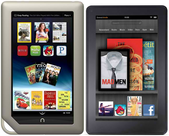
Kindle Fire and Barnes & Nobles Nook Tablets : Quick Comparison

Kindle Fire and Barnes & Nobles Nook Tablets have been launched back to back. However, the competition between these Products does not seem to be tough at all.

Kindle Fire comes at a low cost of $199, Nook is priced slightly higher at $249.

Compare the Features and Specifications of both these Products and you will realize, it is worth spending 50 Dollars extra for buying the Nook.

A quick comparison of the Features and Specifications of both the Products is given below:

Features and
Specifications
Amazon
Kindle Fire
Barnes & Nobles
Nook
Screen Size 7”. IPS
1024 x 600
7”. Vivid View IPS
1024 x 600
Processor 1GHz TI OMAP 4
Dual Core
1GHz TI OMAP 4Dual Core
RAM 512MB 1GB
Internal Memory 8GB Total
~6GB for Amazon Content
16GB Total
13GB for B&N Content2GB for System Apps
Available Memory ~2GB 1GB
Home Screen Button No Physical Button Has a Physical Button
OS Android
Gingerbread 2.3
Customized for Amazon
Android
Gingerbread 2.3
Customized for B&N
SD Card Slot No
Storage on the Cloud with Amazon EC2 Technology
YesSupports SD cards for up to 32GB Storage
Applications
Downloadable from
Amazon AppStore Nook Apps
Dimensions (Size) 7.5 x 4.7 x .45” 8.1 x 5.0 x .48”
Streaming Services and
Applications
Netflix, Hulu Plus, Pandora, Amazon Cloud, Media Player, Amazon Prime, etc. Netflix, Hulu Plus, Pandora, etc.
Document formats Kindle (AZW), TXT, PDF, unprotected MOBI, PRC natively, DOC, DOCX ePub, PDF, LS, DOC, PPT, TXT, DOCM, XLSM, PPTM, PPSX, PPSM, DOCX, XLX, PPTX
Media Playback Audible (Audible Enhanced AA, AAX), JPEG, GIF, PNG, BMP, non-DRM AAC, MP3, MIDI, OGG, WAV, MP4, VP8 MP4, Flash, 3GP, 3G2 MKV, WEBM (Video Codecs: H.264, MPEG-4, H.263, VP8), JPG, GIF, PNG, BMP, MP3, MP4, AAC, AMR, WAV, OGG (Audio Codecs MP3, AAC, AMR, LPCM, OGG Vorbis)
Battery Backup
(With Wi-Fi Disabled)
8 Hrs.
of Reading Time
or
7.5 Hrs. of Video Playback.
11.5 Hrs.
of Reading Time
or
9 Hrs. of Video Playback.

Symbian Belle – Buzz All Around !

Symbian Belle is the buzz that has been around for while with many devices already been launched and  some models due for an upgrade. The  Nokia 600, Nokia 700, and Nokia 701 are the devices that are ready to use with Symbian Belle.

Why does one need to migrate from Symbian 3^(Build Anna) to Symbian Belle?

The UI has changed to a reasonable extent considering the Symbian development cycle is finished. Nokia has still made an attempt to make sure that it cares of its existing users.

Tops Visible Changes Include:

  • Flexible Widgets
  • Smooth Sweep
  • Notifications Bar
  • Toggle Widgets
  • Modernized Menu
  • Contacts
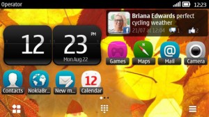
  • Flexible  Widgets

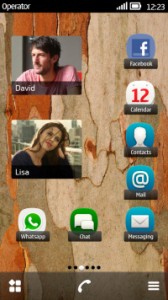
If we compare the home screens of a Symbian Anna and Belle based device, the widgets on a Belle based device are more flexible and easy to customize leaving the user with ample space and adjustment options and making the phone more personal. The image below is an example of the customization options.

  • Smooth Sweep

The Overall improvements have led to a smoother interface where once can switch between home screens at a faster speed without an inconvenience, although this might vary on handsets depending on display type and the overall  hardware performance.

  • Notifications Bar

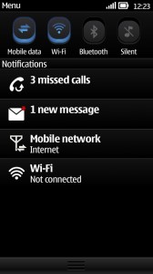
The Notifications Bar  is similar to the Android operating system, the top swipe displays a menu providing access to Mobile Data, Wi-Fi, Bluetooth, Messages and Missed Calls which is comparatively much better than Symbian Anna.


  • Toggle Widgets

Toggle widgets are a great way to make things easier which includes Wi-Fi On/Off , NFC, GPS, and Packet Data widget. Toggle between services to enable or disable them.

  • Modernized Menu

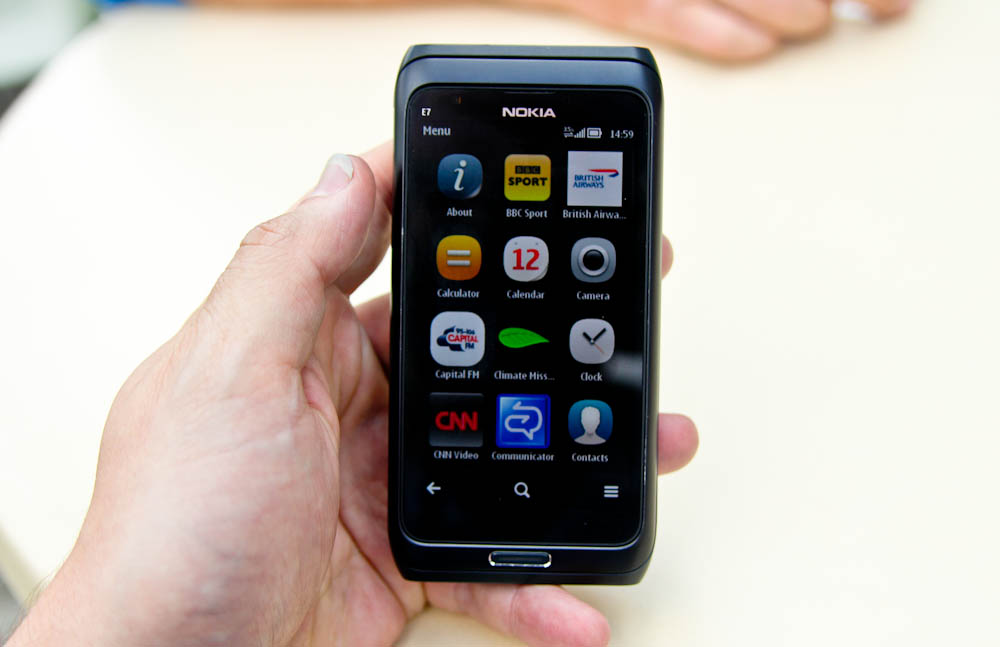
The menu design is similar to the Nokia N9. Folder based navigation is no longer a part of the menu, all menu items are accessible within the main menu.

  • Contacts

Contacts have been given a good space and room within the widgets area of different home screens one can add various contact widgets, it includes contacts with larger image and better visibility also the ability to drag an individual contact from one home screen to another.


Still Waiting for the Symbian Belle Update for My Nokia E6-00, will keep you posted with an interactive post or a video once I’ve experimented more.